Wednesday, December 16, 2009

Saturday, November 28, 2009

Wednesday, November 25, 2009

Anti-racism P.S.A. analysis

http://www.youtube.com/watch?v=HRfjLfyXYlA&feature=fvw


1. What is the main focus of the video? (i.e. the impact of prejudice, discrimination, systemic discrimination, racial slurs?)
This video focuses on prejudice and how the black man feels.

2. Describe how the video gets this point across.
The video shows the pre-judgement of the white woman in the elevator against the back man.

3. What techniques are used in the video to help convince the viewer of the point of the video. (Look at shots, music, content, text, voice, voice-over, sound fx etc.)

Monday, November 9, 2009

How to approach a video story in the best way.

http://masteringmultimedia.wordpress.com/2008/02/14/sequencing-the-foundation-of-video-storytelling/

Above is an article from http://lcicommtech.blogspot.com/
Here's a summary on the site above that explains how to approach a video story in the best way.

  • Sequences compress time in a video story.
    (without compression your video will be long and boring)
  • Use proper sequencing by using a variety of wide, medium and tight shots.
  • Consider taking 3 second shots of one thing and sequencing them all together rather than showing all the action in real time.
  • Remember to shoot a variety of shots
    (you can never have too much to edit from)

Friday, November 6, 2009

Edited contouring picture.

This is my edited version of one of the pictures of out recent pictures.
We worked on contouring and each created a square and put them together at the end.
I edited the brightness and contrast on this picture to make it look nicer than the original picture. I also cropped it so you couldn't see the background.

Exit sign project.


For this project three people were put into a group. We each had to take different shots of an exit sign from several angles and distances. Once we put the shots together, we organized them into a video with a couple seconds for each shot. Then we added an effect to the video which gave the exit sign a glowing effect. We used a song called 'You Had Me At Hello'.

Tuesday, October 13, 2009


The logo I chose for LongNeck Productions is a giraffe. This animal best represents my company in many ways. LongNeck productions is a graphic design company that will go above and beyond to meet our customer’s expectations. The giraffe represents the fact that we’re a reliable and hardworking company that is bigger and bolder than other companies. Giraffes are very grounded animals, as our company is very down to earth and laid back. Giraffes are known as being loyal and gentle. Our company will do whatever it takes to make sure our customers are satisfied. I chose the colours light blue and yellow for my giraffe because I wanted it to stand out. I started off by making the main part of the body yellow. Then, for a more unrealistic vibrant twist I added light blue spots. The thin black outline shows that the giraffe is a soft and kind animal. When I first created the text to go with the picture, I left a big space between words which drew peoples eye to a blank space. After I made some changes, the viewer’s eye is drawn to the text, as well as the giraffe. I chose a unique, yet easy to read font. The word ‘long’ is elongated and neck is over top of the word productions. I elongated the word long because giraffe’s have long necks, and it just looked more interesting than a strraight line of words. In this logo there are no sharp or jagged lines. Curving lines create a feeling of harmony and mellowness which made the vibrant colours a little less crazy.

In conclusion, I think the coloured text and picture work the best as a logo. I think it’s more appealing and the colours really draw your eyes to it.

Friday, September 18, 2009

Repetition and Rhythm Assignment. Version 2

The rhythm I created in this pattern had a jagged affect, but at he same time it has calm straight lines in between to even it out. I made the straight lines bold so that they would stand out and overpower the jagged lines to make this pattern less crazy. The stable, bolded lines neutralize the thin, unstable jagged lines. This pattern reminds me of escalators, the jagged lines are the stairs and the bold slanted lines are the hand rails. 
Repetition and Rhythm Assignment. Version 1


Okay so, this pattern consists of several triangles. I bolded some of the lines to make one big triangle stand out so that when you look at it, your eyes are drawn to the middle of the pattern. 

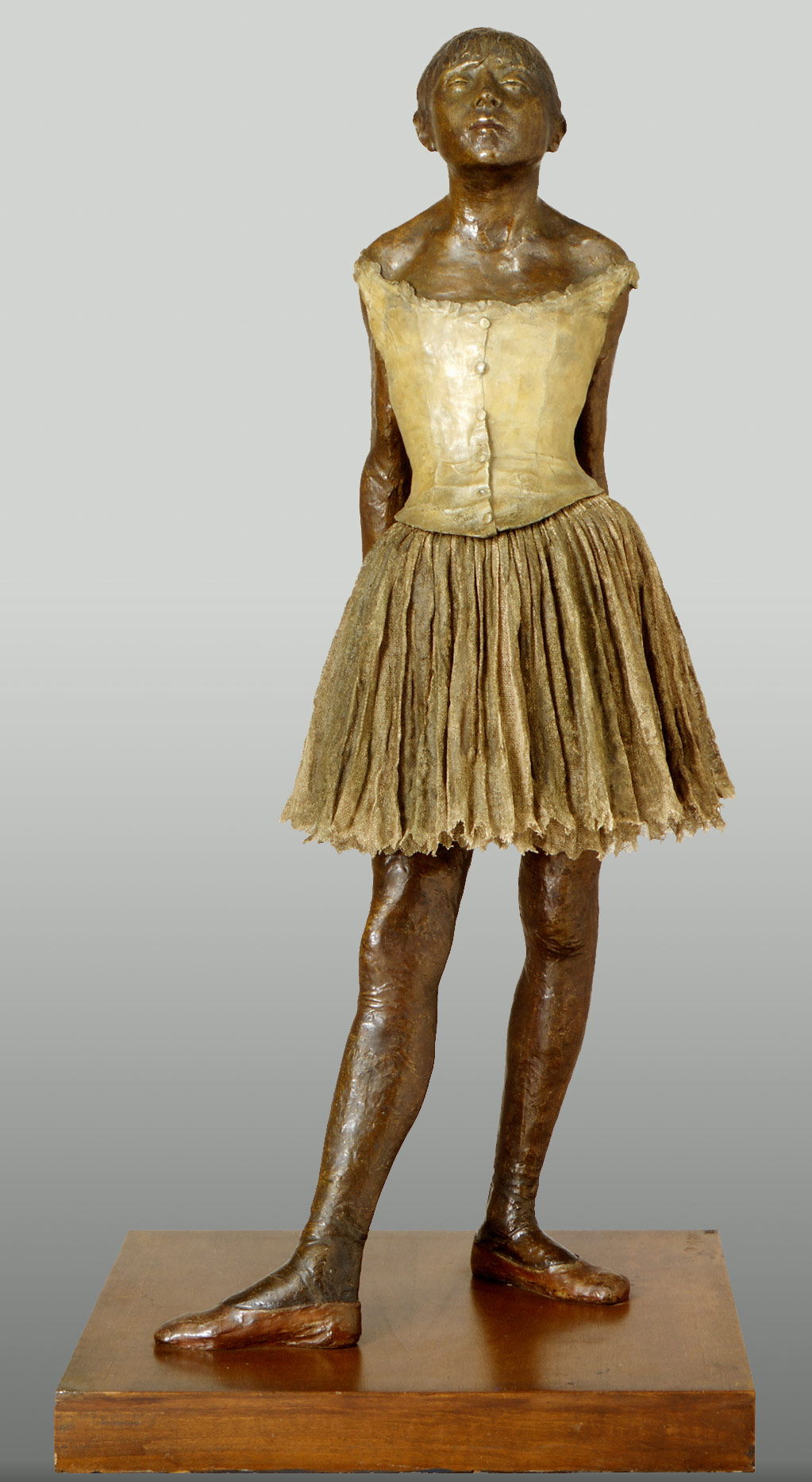
Degas, "The Little 14-Year-Old Dancer".

I'm critiquing "The Little 14-Year-Old Dancer" by Degas for imitationalism. The girl in this piece looks very realistic, but the fact that she's made of wax and she's gold makes her look fake. Her dress looks much more real than her body. There's proper shadowing that proves that this piece is a sculpture, which makes this even more less realistic.

Now I'm critiquing this sculpture for emotionalism. This work or art delivers a lot of emotion. When I look at the girl in this sculpture I feel proud. The expression on her face and the way she's standing with her arms behind her shows that she's not afraid. It feels like she's dedicated and ready for her next dance class. She comes across as disciplined and hardworking.

I still really don't understand what formalism is, but I went around to other people's pages and read about what they had to say. There's not a very wide variety of colours on this sculpture. I can't talk about negative and positive space because this is not a painting or drawing. The texture of her dress is flowing and somewhat shows some movement. Overall, there's not alot of movement shown in this sculpture though, because she's standing straight and still. I find 'Formalism' the hardest because I don't really understand what it is, and when I look on other people's pages they're critiquing paintings and drawings.

Wednesday, September 16, 2009

First day.

Okay so, today we're making our blogs. 
I honestly have no idea what a blog is. 
THE END